Tips on establishing a design system as a startup
By Ai Lee —
In between managing uncertainties, navigating a competitive landscape and finding product-market fit, a design system is often low on the priority list for early-stage startups. But here’s some tips for how you can make it happen and end up with a better product.
When you’re a small team tackling a potential beast like design system, knowing what to tackle first can be a daunting task.
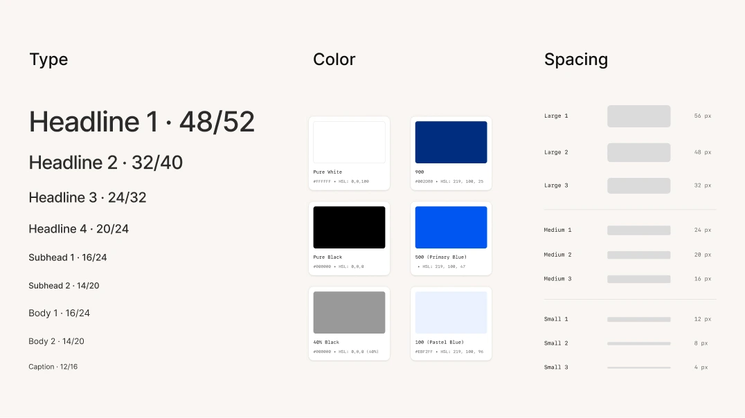
Spend some time establishing foundations like typography, colour, spacing, point system and some core atomic components (buttons, input field), which will become the building blocks of your entire design system.

Use your design software to build your design system. We use Figma for all our design, which means we can leverage Figma’s capabilities to create a component library that is easy to update and consume by all design files. Remember that you can always add variants and fine-tune the styling later.
While you may not have the resources to dedicate someone 100% to your design system, it is important that design and engineering work together to build it. This way, both teams can identify new elements or flag inconsistency, and ensure a cohesive experience as you build. It also makes life easier for the rest of your teams.
It’s my role to do this for the design team at Kinde. I probably spend about 80–90% of my time working on features, but also spend a day a week or some downtime between projects managing and maintaining the design system. I keep track of new design and elements, create and refine components and variants, and touch base with engineers. Making small, incremental changes keeps the system manageable and keeps the team moving forward.
We don’t let too many updates accumulate, otherwise it’s like trying to weed a garden after letting it go for an entire season: overwhelming and painful.
We knew it was going to take a lot of work and time to achieve a fully robust design system. So we approached it the same way we approach our product, by prioritizing the most important tasks.
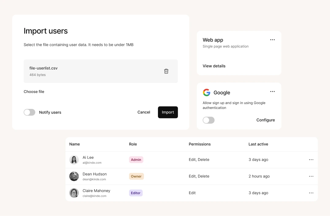
This will be different for every product, but as you design new features, look for the recurring elements and patterns that need to be built first. For us, it was dialogs, tables and cards. We established a consistent pattern, rule, styling and behavior for those components (including padding or defining full-width content, etc).

As we designed each component, we synced with engineering, engaged in rounds of component reviews, and then gradually remove all hard-coded and bespoke elements in the product to replace them with the design system version.
We didn’t componentize everything in one go. And you don’t need to either. When you have limited time and resources, start with the high impact elements, and systematize components that will yield the greatest efficiency for both engineers and designers.
Working on and designing new features will often require you to push and explore outside of the components you have. This is when your existing components come in handy. They are designed to impose limits, but they are also a great starting point for getting creative.
A design system is there to help standardize things but it shouldn’t be restrictive or rigid. When you are trying to break out of your established components and patterns, to push boundaries and explore, you need to go beyond the component and evolve to your product’s need. This is what happens as you grow, and it’s also how you innovate.
Once it feels comfortable and right, you’re ready to componentise, update and consume, and because you’ve set up a good foundation, this process won’t be difficult.
When thinking about whether you need a design system, remember that there will be time later to replace a set of icons or update a pattern, but less time to retrofit an entire system. Part of the system’s efficiency is in re-using and leveraging established patterns.
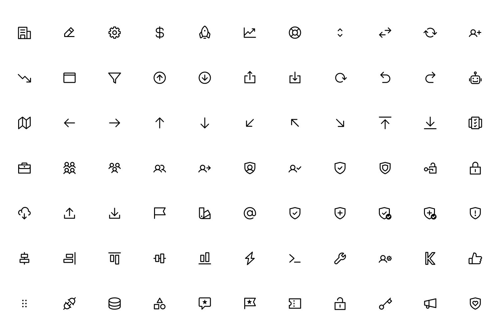
Before we started building and using our own custom icon set, we were using Feather Icons for all the icons in our product. We decided not to invest early when there was something that we could ‘borrow’.

There are many tried and tested design patterns available if you have limited resources, and don’t want to start everything from scratch. There are open-source design systems you can start with, but just make sure the option you choose has proper component nesting and allows you to update the styles in the future.
If you are stuck, check out component.gallery for some inspo.
I cannot stress this enough: designers must have regular check-ins with engineers.
While designers are working on creating and maintaining the design system in Figma, engineers are also working with what’s in code. Therefore it’s crucial you work as a team to align on the structure of the components, making sure what is in design — not just in appearances, but how it’s set up under the hood — is aligned with its code counterpart (naming conventions, shared vocabulary, structures, and behaviours).
Regular communication reduces a lot of potential tech and design debt and enables you to move faster as a team and work more efficiently.
We have a weekly sync at Kinde, which is dedicated to design system discussion. This gives us an opportunity to discuss priorities, review components, and provide feedback. Designers can flag any new design elements that are likely going to become components, engineers can flag components they’re planning to build next. This way, we make sure we’re not blocking each other.
Stuff happens when you’re building a product rapidly. In some swarms we’ve been so deep in the feature design that we haven’t had the chance to update the design system. But because of the patterns that we’ve got already, and by collaborating as we go, our engineers are able to predict 75% of what a feature should look like and can start their build. Later, we sync to close any gaps.
Our design system continues to get bigger and we’re working towards including brand guidelines, values, language, content and voice in it as well. We’re also continuously and diligently checking and ensuring our designs conform to level AA accessibility.
It may sound like a lot of upfront work and a bit of trial and error, but we know it is absolutely worthwhile. You need to find the balance that works for you and your team, but most importantly, start building your design foundations and see where it takes you!