Accessible authentication
By Chris Pearce —
Kinde puts people first. As is engrained into our values - “we take care of our people and treat them as human beings”.
We don’t just talk about our values; we live them.
So caring deeply about Web Accessibility is in our DNA. We do our best to remove barriers that make Kinde difficult or impossible for people to use.
When we write, design, and build with accessibility in mind, everyone benefits as an accessible site is a more usable site. When it comes to our mission, creating a world with more founders, we’re ensuring they reach the maximum number of people and potential customers.
We’re striving to conform to level AA of the Web Content Accessibility Guidelines (WCAG 2.1) across Kinde.
We’re making progress helped immensely through Kinde’s design system (DS), where we’re scrutinizing everything Kinde UI, including accessibility.
As part of the acceptance criteria checklist for new DS components, we ask ourselves, Is this accessible to WCAG 2.1 AA standard? Which includes but is not limited to:
- testing with assistive technologies like screen readers, for example, VoiceOver on macOS,
- making sure everything is operable and navigable with a keyboard,
- all colors meet WCAG’s color contrast ratios,
- content is still readable when text gets resized by 200%,
- valid and semantic HTML gets used.
We also often refer to these excellent checklists:
As the DS gets more coverage, naturally, we’ll become more accessible.
We understand the accessibility journey never truly ends, and for a seed-stage startup like us, where the pace is fast, ensuring everything gets built and designed accessibly is challenging.
However, by having accessibility at the forefront and baking it into the Kinde DS, we’re confident that the Kinde product and website will be as accessible as possible.
An excellent place to start the accessibility journey is on the pages that make up Kinde’s authentication solution, which you can read more about on Kinde’s homepage and in the Kinde documentation.
The primary authentication pages are “Sign in” and “Sign up”.
We understand that you cannot rely on automated accessibility testing alone. The criteria to determine if a webpage is accessible is subjective enough that automated testing tools cannot solely assess accessibility. Human evaluation is needed.
For example, accessibility tools fall short on accurately assessing an image’s alternate text to see if it’s adequately informative.
“The main thing to remember is that automated tests are a great way to get started and find the most obvious flaws. But they are not the end of the process if you really want to create accessible products.”
— Christian Heilmann, Automated accessibility testing gets you on the way, but doesn’t find all the problems
However, automated testing is still super valuable and efficient in detecting low-hanging fruit issues like basic color contrast, the presence of page titles, etc.
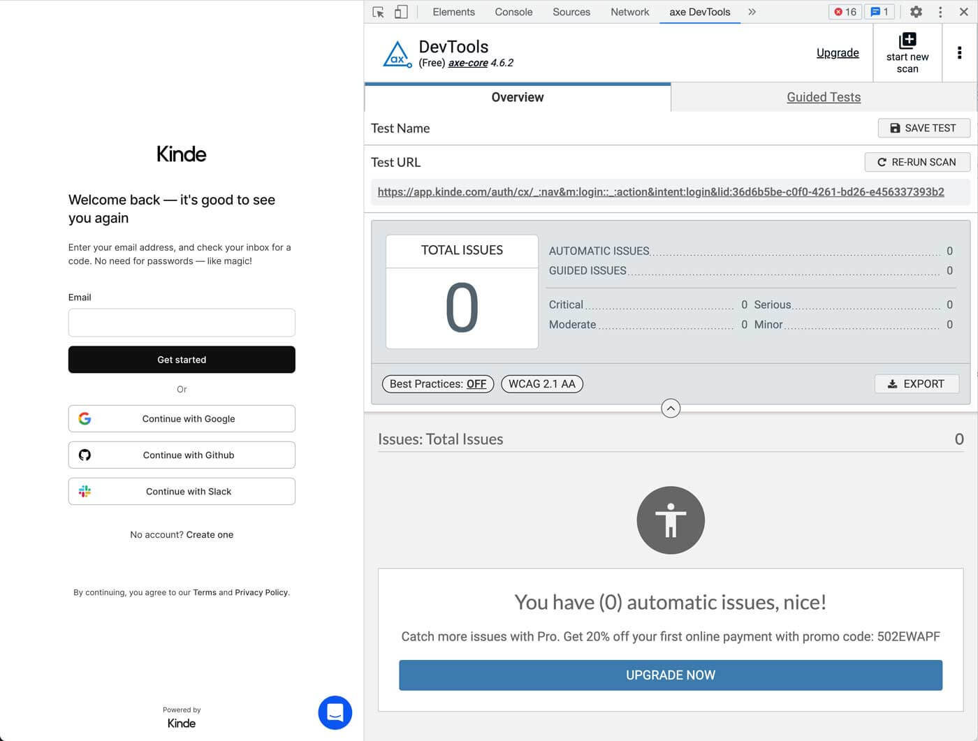
Axe-core is one of the leaders in this space. We use their browser extension to scan pages to catch low-hanging fruit issues.
Currently, all our authentication pages return zero issues.
We aim to integrate axe-core into our codebase, allowing us to automate accessibility testing alongside our regular test suite. This is powerful as it embeds accessibility testing into our day-to-day development process vs. something that gets looked at at the end or overlooked altogether.
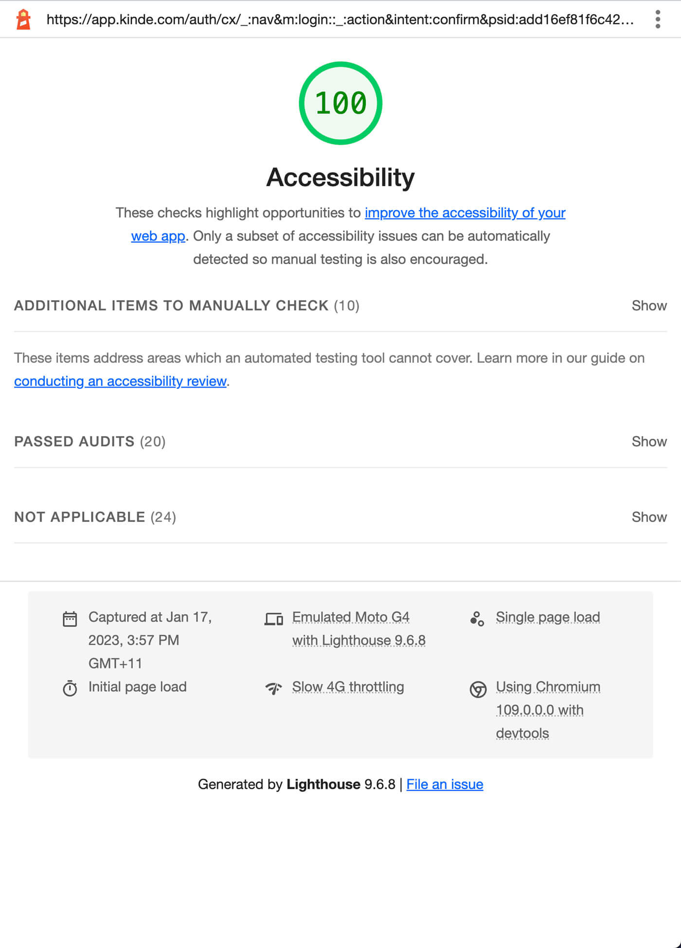
Another tool we utilize is Lighthouse, which helps improve the quality of web pages, including accessibility.
Like axe, we currently have no issues, scoring 100/100 for the accessibility audit across all authentication pages.
We may consider adding Lighthouse CI to avoid running Lighthouse manually. Like axe-core, we’ll get accessibility testing baked into our development process.
In addition to axe and Lighthouse, here are some other tools we occasionally reach for:
- WAVE - a browser extension for detecting accessibility issues.
- HTML5 Outliner - a browser extension for generating a navigable page outline with heading and sectioning elements.
- 44x44 Pixel Cursor Bookmarklet - a bookmarklet to change your cursor to 44x44 pixels square for testing WCAG’s Target Size.
As mentioned above, under the acceptance criteria checklist for new DS components, there are a number of standard manual tests we perform. Here are some key ones:
Inspecting the Accessibility Tree of a page via a browser like Chrome is an essential part of our accessibility testing. It shows us that we’re using the most semantic HTML, the foundation of web accessibility.
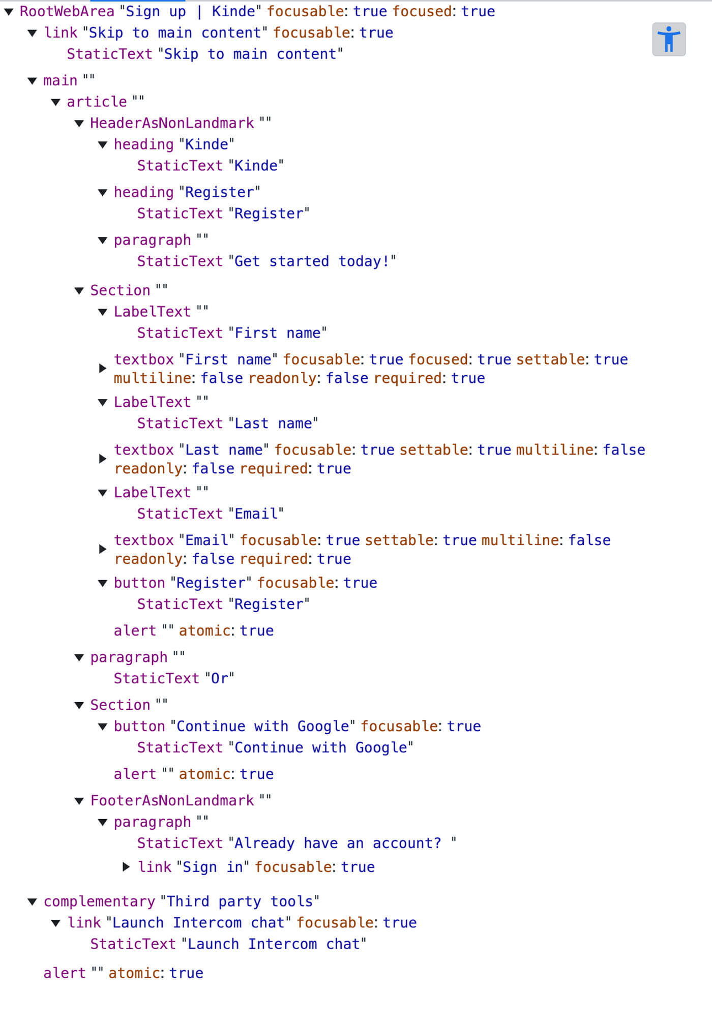
Each authentication page’s accessibility tree reveals a sensible structure that should result in a functional screen reader experience. We also test the pages with an actual screen reader to validate this.
Running pages or an entire user flow, such as signing up and signing in to Kinde via a screen reader, is vital to manual accessibility testing as you’re getting an auditory experience vs a visual one providing an entirely different perspective. This type of testing can uncover many issues easily missed by reviewing a visual experience alone.
Furthermore, screen readers exclusively or primarily use the keyboard for navigation, revealing if a webpage is operable and navigable via a keyboard, another integral part of manual testing.
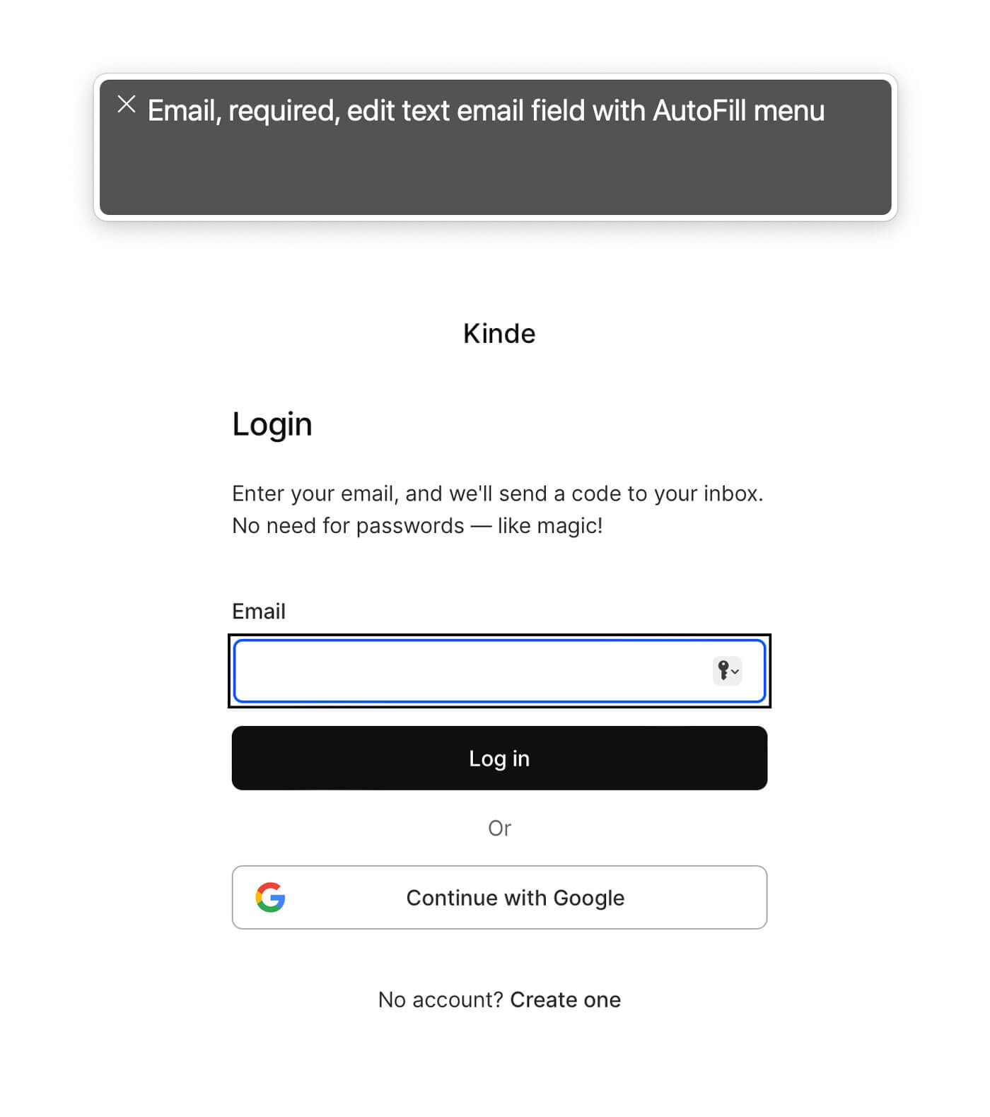
For our testing, we primarily use macOS’s built-in screen reader: VoiceOver and supplement with Window’s free screen reader: NVDA.
We feel the auditory experience of the Kinde authentication pages in VoiceOver and NVDA is fine—everything on the page is accessible, navigable and announced sensibly.
Some additional manual accessibility testing we perform include:
-
Keyboard access and visual focus - ensure content and functionality is accessible through a keyboard. Note: Some of the page’s UI elements, like the primary CTA, suffer from a custom focus indicator that is not prominent enough, which we’ll look at fixing soon.
-
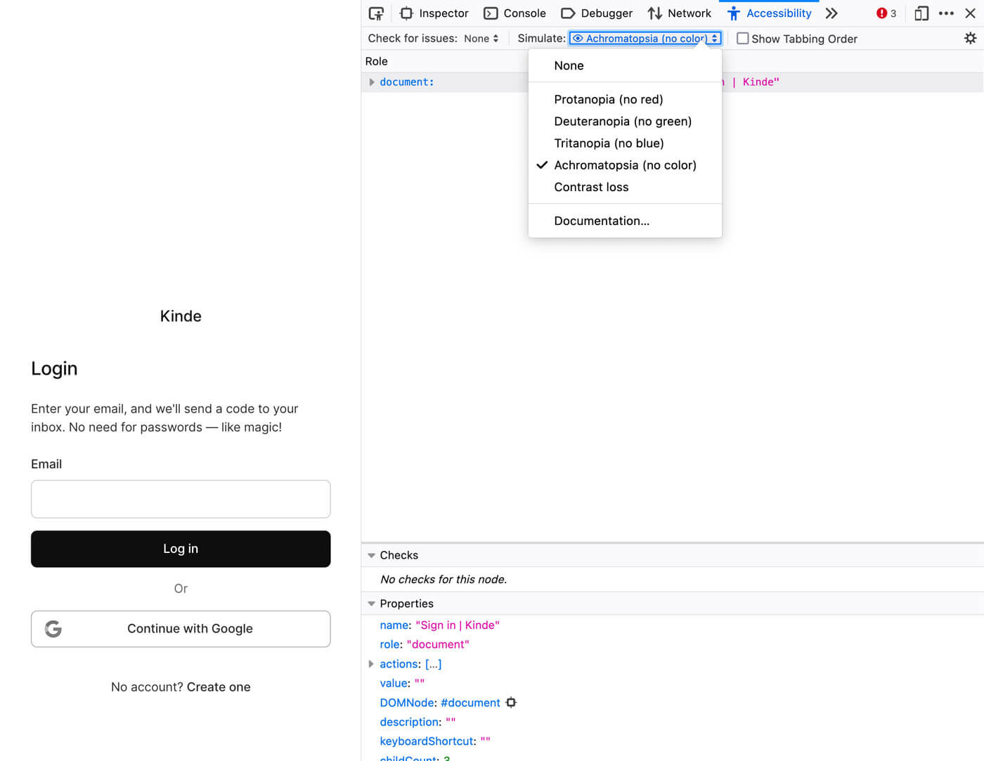
Color vision simulation - ensure everything displays OK for visitors with various forms of color vision deficiency. For example:
- Protanopia (no red)
- Deuteranopia (no green)
- Tritanopia (no blue)
- Achromatopsia (no color)
-
Resize text to 200% - ensure everything is still readable and usable when the text size is changed mainly via text-only zoom.
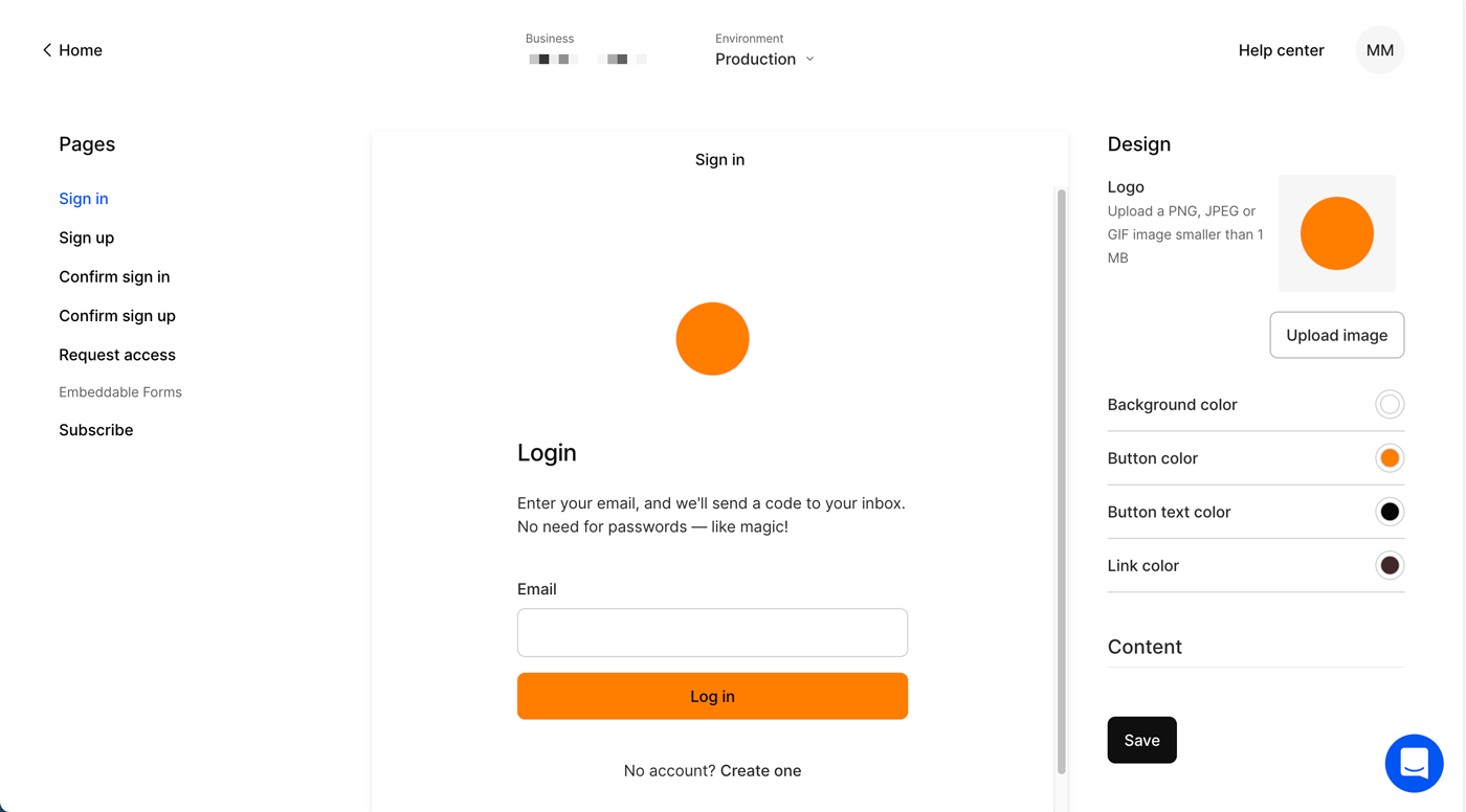
Kinde has a Page builder, allowing customers to tailor the authentication page’s design to match their brand. For example, add a logo, update colors, modify content, etc.
Customization like this raises some interesting questions when it comes to accessibility. For example: “How far do we go to try and protect against accessibility failures such as poor color contrast?”
The current Page builder customization options are intentionally simplistic to balance the integrity of the page design with the customizations applied. We accomplish this by allowing changes to specific elements in the page’s content area, or Card, mainly:
- changing the call to action button colors (background and foreground),
- changing the link color.
We also allow adding a logo to the top of the card area where we programmatically assign the logo’s alternate text using the customer’s business name followed by the word “logo”, for example, “Kinde logo”.
In addition to the above customizations, we also allow the page’s background color to be modified, which doesn’t affect the content card due to its fixed white background. But it can negatively affect the accessibility, specifically: Success Criterion 1.4.3 Contrast (Minimum), of the two non-customizable elements outside the card: “the disclaimer links” and the “Powered by Kinde” element.
We do our best to solve this by passing the custom page background color through a function that determines if the custom color is “light” or “dark”. We can then change the color of the non-card elements based on that, attempting adequate color contrast.
Being in control of most of the page means we can control much of the page’s accessibility concerns. But not for long, as we’ll significantly enrich the Page builder next year to include many more customizations. With this enhanced experience we predict that the most common accessibility violations will likely be inadequate color contrast.
WCAG 2.2 (we’re currently following 2.1), is the next version of WCAG scheduled to be completed and published in early 2023. Once 2.2 is published, we’ll adopt it.
The WCAG 2.2 draft provides nine additional success criteria from WCAG 2.1, and you can view the changelog here. One of the 2.2 additions stands out for us is Success Criterion 3.3.7 Accessible Authentication.
This new success criteria requires an authentication process not to rely on a cognitive function test, which WCAG defines as:
A task that requires the user to remember, manipulate, or transcribe information. Examples include, but are not limited to:
- memorization, such as remembering a username, password, set of characters, images, or patterns. The common identifiers name, e-mail, and phone number are not considered cognitive function tests as they are personal to the user and consistent across websites;
- transcription, such as typing in characters;
- use of correct spelling;
- performance of calculations;
- solving of puzzles.
This is an excellent addition to WCAG, as cognitive function tests create accessibility barriers.
In addition to providing multi-factor authentication (MFA), Kinde offers passwordless authentication free of any cognitive function tests, as we say: “Free your users from passwords”.
Not only is this the secure way to do authentication, something we’re very passionate about, but it is now, or will be in early 2023, recognized as an accessible way to authenticate.
Kinde covers both!
We hope you enjoyed this post and gained some insight into accessibility at Kinde, specifically how we’re making Kinde’s authentication offering accessible.
We’re excited about the rest of our accessibility journey across the Kinde product and website and will endeavour to report on the progress. We’ll also be adding an Accessibility Statement to our website fairly soon.
To help us improve, we’d love feedback, especially from people who use assistive technologies on things that are hard or outright impossible to use, both for the Kinde product (you can access Kinde for free here) and the website. You can send your feedback to support@kinde.com, prefixing the subject with “Accessibility feedback”.
Thank you 🙏.