Pattern recognition: why content is essential to product development
By Claire Mahoney —
Everyone knows that digital products are built by developers and shaped by designers, but did you know that words are another critical element of what you build?
This is Kinde without any words. Could you get anything done?
I know it’s easy to show why content matters when you make a screen blank like this, but it does highlight just how much of an interface is read by users, so they can interact.
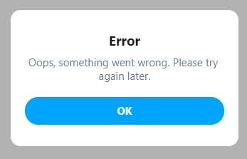
Crafting interaction content is not just about adding words, though. Content has to be clear, useful, meaningful, consistent, and actionable. Pretty much the opposite of this:
Humans look for patterns everywhere and like to recognize familiar ones. Personally, I shop at the same grocery store all the time because I know the layout. I don’t like that they keep the milk in the far corner, but I always know where to go when I need milk.
It’s the same with content in a digital product.
People want to rely on the patterns that you set out for them, so they can do what they need to do and move on. Here’s some of the elements that make up interface content patterns.
These items “frame” your product and help orient users wherever they go. You want these labels to be as simple, clear, and familiar as possible. You’ve probably given thought to your product architecture - this is where you describe it for your users.
Usually menu items are all nouns (things), meaning they are a labelled groups of functions, and not actions (verbs). Here’s some examples.
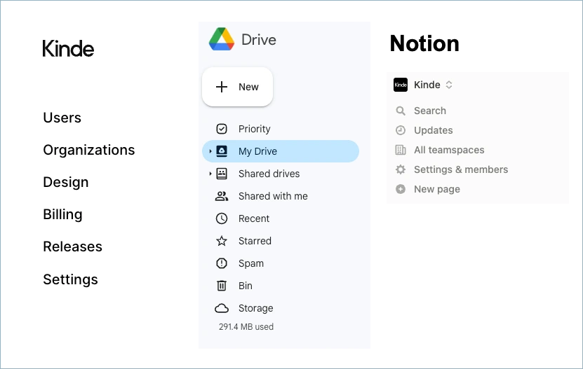
All products have repeat container types that nest functions and objects within them. These should be labelled using a consistent pattern across your product to make navigating easy. For example, page names should align to menu items.
And dialogs that add an object, should continue the pattern one level down.
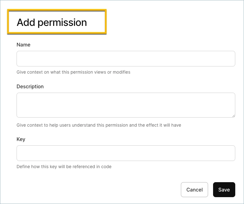
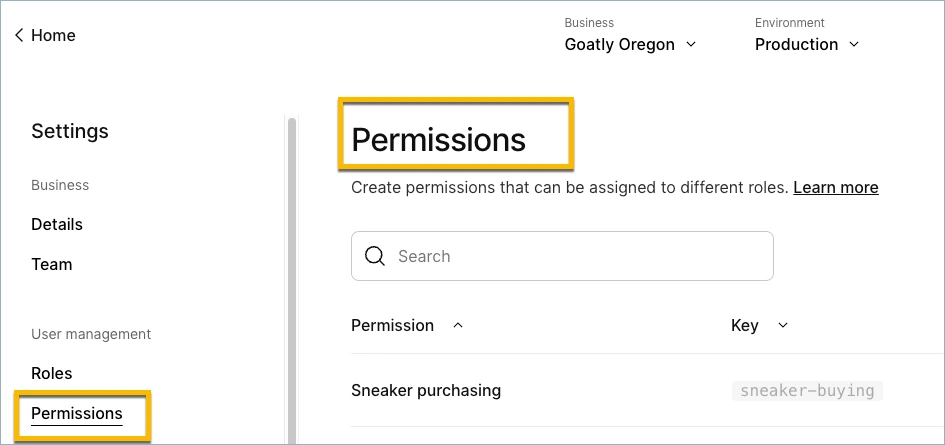
Tip: Write a procedure to navigate to a task, to check if it makes sense. An example from above would be:
- Go to Settings > Permissions.
- On the Permissions page, select Add permission.
Consistency of terms helps anchor users in their tasks and move around a product more confidently.
Okay, don’t be offended by this, but your users don’t use your product because they like using it, they use your product because it helps them do a task. Read that again.
One of the make or break characteristics of your product is how easily a user can do what they want to do. If your design and content gets in the way, expect increased churn. But if your design and content clears a path to getting a task done, you’re onto something great.
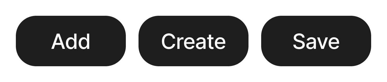
That’s why your main interaction objects - buttons, fields, checkboxes, etc. - need to be really easy to find, understand and use. Here’s a few guiding principles for naming them.
-
Buttons are always verbs because they are an action. Use just the verb “add”, “save”, “edit”, or use one verb and a noun. “create x”, “add x”, “edit x”. Choose one pattern and stick to it. Please never use “Create new” unless it’s also an option to “Create old”.
-
Fields are where users enter stuff. Make this easy by describing what has to go there in as few words as possible. Why say ‘Enter name’, when ‘Name’ will do?
-
Always use “parallel naming” for checkboxes and radio buttons. This means the choices are equivalent and do not require added effort to decipher. For example:
- []Always []Never []Sometimes — (parallel)
- []On []Never []Optional — (non-parallel)
I’ve followed these principles all of my writing career and they are always reliable.
Jargon has a place in all kinds of industries. I sometime think developers speak a type of English that I don’t. But using jargon assumes your audience understands, and in products aimed at a general audience, jargon will diminish the user experience. If in doubt, ask yourself if people get annoyed at things being too simple, or if they get annoyed at things being too hard.
And by time, I mean every extra millisecond adds friction, and every added complexity slows cognitive processing. So if you use the word “Utilize” instead of “Use” you’ve just added reading time and a millisecond to my ability to understand. Do this 20 times in your product and I’ll end up abandoning you.
If you are building a product that you want people to use, enjoy, and find easy, then you absolutely have to spend some time focused on content. Because when you clear a path for your users, and remove friction from their journey, they will never want to go anywhere else.